
Spindeterminante.
Wednesday, February 6th, 2008
I knew things were going to be interesting when I was picking up some Cold Dairy Product for our Super Tuesday night dessert at the grocery store we generally avoid. A thirtysomething African-American woman and a thirtysomething pasty white woman were chatting in the aisles. Said the former:
“I just don’t think he’s ready yet. It’s gonna happen. It can happen now. But he doesn’t have the experience, and she does.”
On the other hand, Fulton County went overwhelmingly for Obama (as did I, by the way, with a friendly goodbye wave in John Edwards’ direction)…so what does any of it prove?
The nice thing is that we have all kindsa great online tools to look at the returns. I’m annoyed as heck at CNN, who puts all these powerful visualization tools in the hands of John King and Wolf Blitzer (“Wolf! Step away from the multitouch display!”) and yet on their massively-promoted website, all we get are county-by-county results in tables…no map!
This just in. Maps are good! Visualization is good. These maps showing winners by counties can be illuminating, thanks very much New York Times.

Even more illuminating though is the breakdown of results by margins..that is, the colordot is small if the candidate won by a tiny amount, more huge if he or she took the region decisively:
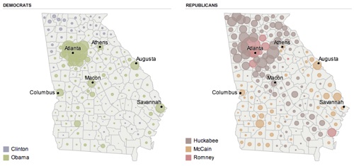
It’s pretty much that way from sea to shining sea…a lot of counties, on the democratic side, where the margins are razor-thin…this really is turning out to be a 51/49 kinda thing, Obama here, Clinton there. (On the Republican side, I’m unnerved as usual by the amount of fervent Christian politics that surrounds the Atlanta metro area. They like Huckabee, yeah, I can see that. So sure, go ahead, run him in November.
So what to do? Unleash the spinmeisters! (Just you wait.)

And while you’re at it, unleash the headline-writers. I’m entertained by this page of post-SuperTuesday front pages from across the country, which seem to empty the thesaurus in search of words that indicate a lack of decisive numbers…at least for the most part. Sprint marathon attack fight surge near-knockout epic battle…and then, in New Orleans, it’s simply carnival time.
I mentioned that I watched a fair chunk of the results come in using that increasingly antiquated device, the television. Let me just take a second to jot a few notes about what the traditional media outlets put before our eyes:
- Best visualization of exit polls: the virtual floating 3d chart thingy next to the quite caffeinated Ann Curry on NBC (and MSNBC). Clean, dimensional, and when the director let the camera man stop drifting back and forth to show us “hey, look, it’s 3d!”…quietly effective. And Curry, who I often find unwatchable, had her bullet points honed, focused, and clear every time I watched.
- NBC’s leaderboards, on the other hand, started with beautiful, clean, high-def columnar backgrounds marred by a repetitive twitchy spinning choreography of foreground elements that was beyond pointless. When Brian Williams had to plow through a set of a dozen projections, many for the same candidate, we got Hillary’s face spinning dizzily to reveal…Hillary’s face which then spun dizzily to reveal…well, you get the idea.
- NBC’s lower-third results: extremely clean, especially in HD.
- Worst verbal setup of exit polling information: Diane Sawyer on ABC. She seemed to be fumblingly reading every third bullet point from her misshuffled notecards, and the result was mass confusion. Was she saying that this number was “all evangelicals” or “all evangelical Republicans” or…well, even Charlie Gibson and George Too-long-a-last-name-for-me-to-type-here were looking baffled, gently correcting her, and in one case, disputing the numbers flatly.
- Most pointless, as usual: having a young woman (apparently only women are capable of this) read and summarize Facebook comments to us. Next, have an old geezer summarize the editorials in our nations’ newspapers! They’re both left to their own..uh..medium, thanks.
- NBC and CBS’s leaderboards had static images of the candidates faces…ABC had moving clips. Somehow the moving clips were much, much better. ABC’s graphics were quite clean in general, although in some cases way too sparse. Sammy kept imploring them to tell us “how many delegates? How many delegates!!?”
- CBS’s graphics get a big thumbs up for focusing on the delegate count again and again. They get a big thumbs-down for having some strange-ass scroll-like shapes and noodle-wobbly checkmarks and in general some graphics that looked like squared-up edges were anathema in CBS-land.
- And I just don’t get CNN’s approach of creating a principal election font that looks like it was pre-smudged while being drawn. That whole CNN=Politics look feels like “we spent all this money on high-resolution imagery so we could show you…behold!…smudgy stuff!” But man, they sure know how to count down to the next..uh..thing, whatever it is. CNN, your countdown clock channel! We know timers!
- At one point, WSB had squeezed back ABC’s coverage here to show, in an extremely unattractive way, results of how many people (13!) voted for…John Edwards in Arkansas!? In general, local graphics were lame…and WSB’s were the worst.
