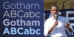
Gothamed City.
Thursday, February 21st, 2008
 Sometimes, a movement can be defined by a typeface. But sometimes, good typography just allows the truth to speak in a clear, unflavored voice. I know the first time I saw a ‘Change we can believe in’ banner behind Barack Obama, I was pleased and inspired by his team’s smart choice of Gotham, a typeface I’ve been (over?)using a lot lately, and one that, for some reason, gives me a centered, unsubtle sense of well-being every time I gaze upon its sans-serifed geometries. Ahhh.
Even though, as the font’s designers explain here to ‘Helvetica’ filmmaker Gary Hustwit, the font’s origins (and those of its creators) are firmly of the windy streets of New York City, I think the face transcends the Grande Pomme and in fact speaks to me as confidently from snow-filled Iowa and sun-drenched California as it would from the deep shadows around the Port Authority Bus Terminal or the glassy trendiness of, well, what I imagine the headquarters of GQ magazine to be.
It’s just a darned pretty sans-serif. It stands up to abuse. It’s modern indeed. And thanks to the 2008 campaign, it’s everywhere you look.

