
The sum of all ego.
Thursday, June 7th, 2007
 Well, by now you’ve probably heard the general shudder of revulsion heard round the world over the London 2012 Olympic Logo. It has been called…well, everything you can imagine, except “nice”.
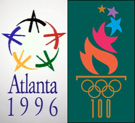
I don’t really want to add to the chorus, except to generically slap my forehead in despair. It brings to mind the transition from the wonderful “bid” logo designed for Atlanta’s attempt to win the Olympics to the more pedestrian logo developed (at considerably more cost) for the 96 games themselves. There is something about the process of logo design for large organizations that inherently creates resentment and ends up reflecting and amplifying the egos of the designers and purse-string holders.
Maybe it’s because we ask a simple mark to do too much heavy lifting. Why is it, for example, that each Olympic games needs its own identity, “brand”, logo? Isn’t that five-rings thing sufficient to sprinkle around the games’ site on banners and number-bibs?
There’s also universally a hue and cry about the money spent to design such a logo (which tends to get muddy because the figures quoted often involve designing a whole system of elements, not just the logo.) Me, I think you ought to get a good chunk o’ change for a logo design—way more than Guy Kawasaki spent on his Truemors’ website logo ($399!? That’s so, so wrong.) but way, way less than the likes of Wolff Ollins and Landor and other fancy firms want to charge.
Something as big as an Olympics? $80,000 US for the logo, tops.
Just the logo. A small logo for a tiny website? Maybe $8,000, no less. There’s a range that probably more accurately reflects the resources available, time spent, and so on.
Maybe I’m just feeling mercenary today. But for that London logo? Not a farthing from me.
