Shaped letters.
Friday, July 24th, 2020

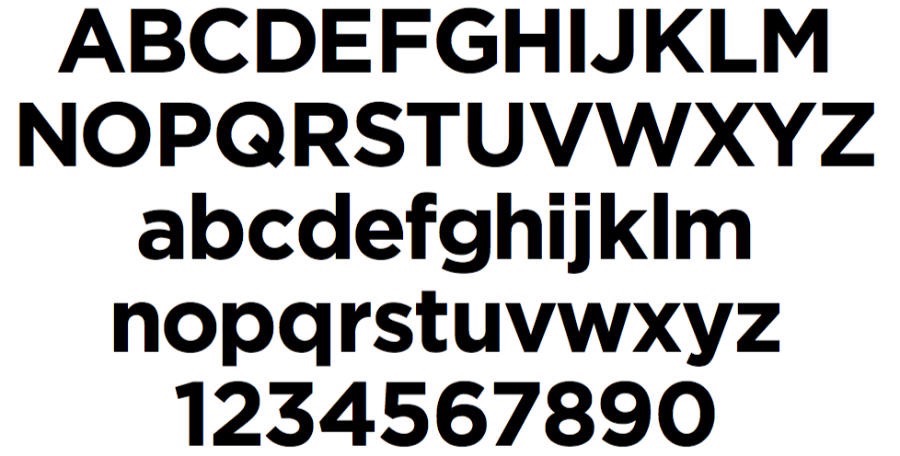
Gotham Bold.

Snell Roundhand.

Clearview Highway. (The modern freeway sign font.)

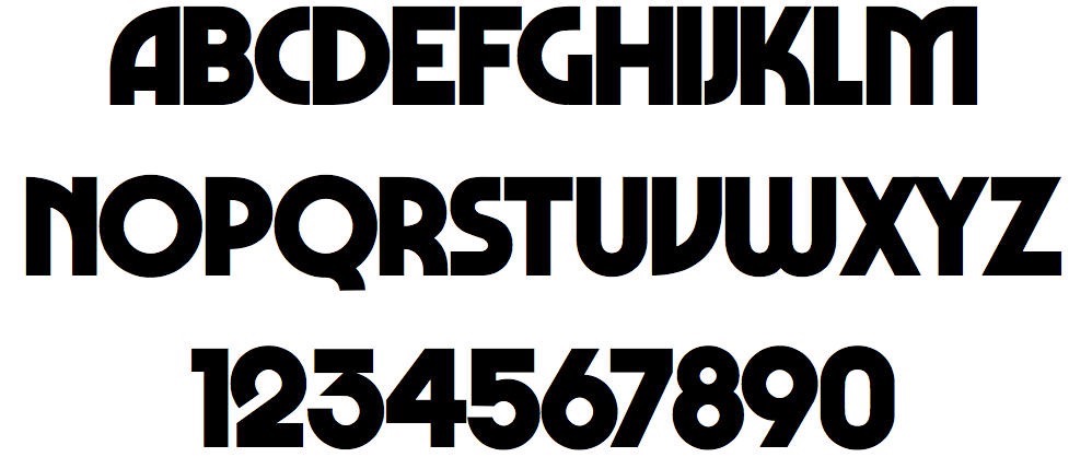
Marvin (or to be precise, the redraw of the 1970s font, now called Marvin Visions).

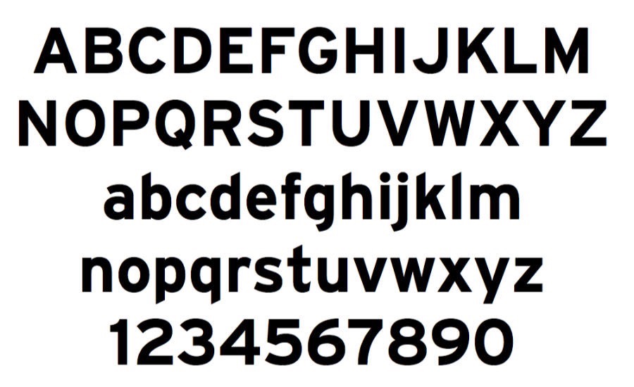
Interstate Bold. (The old freeway font.)

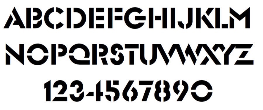
Glaser Stencil.

Lubalin Graph Bold.
I was browsing Font Book the other day—it’s the Mac OS app that manages and displays the installed fonts you have on your system. At home, I have a luxury of lots of disk space and a collection of TrueType and Type 1 fonts that date back decades.
When we travel, I have to stop for a moment and say, “hm, is that one on our laptop too?” I’m often surprised what is and isn’t there. One example: there’s a bunch of stuff from when I was working on a poster while we were staying at an AirB&B in Santa Fe, New Mexico. I finish something like that up and we hit the road, and my workspace is, in effect, paused at the moment I turned our attention back to travel again.
I have, in fact, had to work on a file that required a font that sat back on the big hard drive in Atlanta. Fortunately, if the gods of Internet-ness are willing and our Atlanta home isn’t experiencing a power outage, I can usually yank it from there to here.
But today, I didn’t have any urgent mission, I was just enjoying the labors of font designers who do battle with legibility and tone and balance and consistency. I was letting the letterforms remind me of projects past, of places visited, of freeway signs admired, of invitations received.
One of the fonts to the right reminds me of the bold typography (and imagery) to come out of the Obama presidential campaign. One of them, a longtime favorite, surprised me on the emergency exit door of a mothballed British Airlines Concorde, but you could see it on a TBS Movie open I did back in the day. Two of them show up on American freeways, leading you in what we hope is the right direction. One is a font I used for a magazine ad I designed for my Uncle’s freeze-dried food business in 1972 (don’t ask.) And so on.
They’re all peaceful, and bold at the same time.

