
Goeglein, post-Google.
Friday, February 29th, 2008
Whoa, I can feel the server churning, rumbling the floorboards, serving up pages at a frenetic page under my feet. Well, wait, it’s actually in California somewhere, not here, and it’s not an old-fashioned newspaper printing press belching soy-based ink, but the effects are much the same when people read, react, and change happens. Quickly.
This leap day is one where my college friend Nancy has, after a moment of curiosity and a few minutes of constructive Googling, turned up a big story that could (we’ll see) cost someone at the White House his job. Nancy’s online home is just one of our little ragtag family of sites, so I’ve been keeping an eye out to make sure the server can keep up with the heightened interest.
‘Copycat’ is a simple story of plagiarism, well told, well documented. Nancy published it on nancynall.com at breakfast-time, and before long, the comments on her weblog post began to fill, with the vast majority expressing outrage at White House staffer and Fort Wayne op-ed contributor Tim Goeglein and congratulating Nance on her efforts. There were a handful (one, really) contrary opinions posted…basically taking the position that Nancy should be as offended by Barack Obama’s ‘plagiarism’ of his campaign co-chair, but that comment itself was quickly (and intelligently) debunked by subsequent comments.
At 10:34, one on Nancy’s commentators posted the results of his googling another Goeglein column, and found yet another case of pilferage, this time (amazingly) from a Washington Post reporter.
It’s no small irony (as the “another cases” start to pile up) that one of Nancy’s favorite shows has a serial plagiarist as one of the recurring plagues cast upon Baltimore.
Although she has never had any admiration lost on Goeglein, I know Nancy does have friends remaining at the paper and worries about the painful steps they’ll have to go through to make it right.
Those steps began at 11:10 am eastern, when the news-sentinel.com site posted:
Tim Goeglein, former Fort Wayne resident and now a special assistant to President George Bush, has been accused of plagiarism over a guest column about education that we carried on our editorial page on Thursday. While we look into the matter, we have taken the column down from our Web site. We are also checking out previous guest columns of Mr. Goeglien’s that we published. We will promptly report what we find.
At 11:34 am, The Fort Wayne Journal-Gazette reported:
A Fort Wayne native and White House official acknowledged Friday he copied large portions of an essay that appeared in a Dartmouth College publication and presented them as his own in a News-Sentinel column.
“It is true,” Tim Goeglein wrote to The Journal Gazette in an e-mail. “I am entirely at fault. It was wrong of me. There are no excuses.”
Just before noon, another nancynall.com commenter has posted more similarities in another Tim column, and minutes later, a guy who knows his way around programming languages produced a ‘diff file‘—the Goeglein text computationally overlaid on that of his plagiarism victim…a great way to use visualization to communicate a point.
At 12:21 pm, the News-Sentinel published a short piece by editor Kerry Hubartt saying in part:
He [Goeglein] has apologized to the editors of The News-Sentinel and also said there may be other previous columns he has written for The News-Sentinel that also may contain plagiarized material. We have found material in at least two other previous guest columns lifted from other sources without attribution and are continuing to check other previous submissions.[…] We will not publish writings by Goeglein in the future.
And with a whiff of arrogance that bespeaks old media, there’s NO mention of the key fact that their former columnist was the one who made this morning’s discovery. I hope Hubartt at least writes Nancy a nice thank-you note.
(Update) At 2:08 pm, Washington Post reporter Dan Froomkin tells the tale…and does mention Nance. At 2:45, word spreads. Drudge. Breitbart. Wonkette, who, tongue in cheek, calls her a “lady blogger” with a “lady blog.” A reader on the News-Sentinel site says Goeglein was caught in the Nall of America…heh. Nance’s post now has more than 150 comments. At 2:57, Terence Hunt of the AP files a story that quotes White House spokesperson Emily Lawrimore: “His behavior is not acceptable and we are disappointed in Tim’s actions…He is offering no excuses and he agrees it was wrong.” The piece mentions Nancy by name, and thus, when it appears on the News-Sentinel site, is the first acknowledgement “in the paper” of the source of this revelation. At about the same moment, Editor and Publisher pushes out a piece headlined “Scandal Involving White House Plagiarist Spreads.”
Wow, internet speeds, indeed.
I rock back in my chair and look at my scatter of browser windows from this morning and I marvel at how this story has moved…with more substance than radio or television and with way way way more immediacy than newspapers or magazines can muster. This is a modern process, and it’s playing out with journalistic quality and the multiplier effects of 1) immediate transmission and 2) many eyes and hands on the job willing to take a little of their own time to push the story a little further down the pike.
Part of this process is the active commenting, and a bigger part is the ecosystem of larger-readership bloggers picking up the story, linking to it, advancing it. I suspected premier journalism blogger Romanesko would pick up the story and run with it…and its not surprising that high-visibility blogs like Atrios and Talking Points Memo would get on the story. These “liberal” blogs of course don’t think much of anyone at the White House (nor do I), but they perform a valuable distribution function, getting the story out there in front of eyes of people who would be outraged by the conduct. The question is, if you only read “conservative” blogs, will you be getting this story? Will you care?
After my last weekend at the Computation & Journalism conference a week ago, where I developed concern that the modern online equivalent of journalism—let’s just say ‘blogging’— doesn’t necessarily have the hard work, precision, and impact of its ancient-age predecessors…well, if we had a world of people doing good work like this from their kitchens and home offices, I wouldn’t miss any of the old media, not one bit. Now, we just have to figure out a model to pay them for their efforts, or economically grant them the independence so they have the luxury of being able to do this kind of work and keep the kids in nice clothes.
(End-of-the-day-update:) Just like the finale of All The President’s Men (the movie, not the book)…except accelerate it to 21st century speeds. The dominoes continue to fall, until a press release at dinnertime brings the inevitable end to the story. 250+ comments from Nancy Nall’s readers—an essential part of the equation, but probably a footnote in the mainstream media coverage. The server didn’t go down. One more of the president’s men did.
Sensemaking and nonsensibility.
Monday, February 25th, 2008

[Previously! On Positively Atlanta Georgia! Part one of my visit to the C&J conference is right here.]
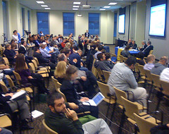
Saturday dawned cold and overcast in Atlanta, and I decided to bring our OLPC XO to the second day of the Computation & Journalism conference, just to test out the wifi reception and to see how annoyed I’d get typing on the tinyish keyboard. Short answer: not that annoyed, and the “ooh, aah” reception the machine got was an education in itself. It’s amazing how many people evaluate the XO for themselves—would this machine work as a high-powered yet portable laptop for me (answer to you, probably not, but if you are 10 years old and living in Somalia, this is a really good tool for your world.) It was clear that folks had not had a chance to physically get their hands on one…which made me wish that the Apple Stores all had a little OLPC exhibit off in a corner, just to let people get a sense of it.
Panel: Advances in News Gathering
Bagel digested and mediocre coffee downed, I went into the first panel, chaired by Medill School of Journalism—that’s Northwestern—professor Rich Gordon, who had that “pleased to have a substantial budget for scholarships” smile on his face as he briefly talked about his part of his school’s graduate program, which takes computationally-minded folks and teaches them the craft, ethics, and smarts of journalism. My take-away (augmented by chatting with some of the academics at this conference) is that a lot of them youngsters are willing to take on the mantle of responsibility that comes with being a no-kidding journalist for one of the same reasons my post-Watergate cohort did: they see problems in society and see the potential for societal good that journalism offers.
And some of them see the powerful computational tools unimagined in the days of manual typewriters and wire tickers and really want to take hold and use them for something more significant than aggregated tweets, pings, diggs, or shared spreadsheets of stultifying somnambulism.
But, back to Gordon, who says his work “playing around in this intersection of journalism and technology” gives him some sociological insights about those two very different constituencies that ring very true to me:
“We don’t understand each other terribly well…many of us in the journalism field don’t appreciate computer science is a creative discipline, and think that computer scientists—programmers—are people who should do our bidding…to build things we want…and I think maybe on the computer science side there is not quite enough respect for the intellectual rigor that a good journalist goes through…or an appreciation of the intellectual and creative challenges of doing that job well.”
Indeed. And I’ll extend that mutual disregard to graphic designers, who at journalistic organizations must have technical and j-school chops: “Crank out my graphic, font boy.” Some of the news execs ordering up tools in yesterday’s session seemed to have that attitude, and I can only hope that Medill and Georgia Tech (and my own almae mater) create a new generation of hybrid newsfolk who will get past that old myopia.
I was sorry to see that the New York Times’ Michael Rogers was unable to make this panel—I think the Times and Times Digital are doing a lot of innovative work and have created an online product with enough depth, vitality, and innovation that it would certainly be my “desert-island choice” if my iPhone could only pick up one broadband feed in the middle of the Pacific.
But speaking of picking up feeds from remote places, CNN’s Paul Ferguson, next up, brought along a compelling promotional video (hey, I used to make those for CNN back when cameras weighed three thousand pounds) that showed just how liberating a smartly-assembled kit of any DV-ish camera, Powerbook, and satellite modem can be to a team of television news reporters trying to get important stories out of war zones, drought zones, and other places hostile to human life in general and journalists in particular. One of the liberations beyond reduced weight and greater portability: the relatively much cheaper cost of broadband/satellite time versus satellite video time (I’d love to know exactly how much that amounts to) makes the decision to cover much less financially-dictated.
I found it telling that his video, loaded with substantial, important reports, was almost all coverage from CNN International—the domestic feed (this is becoming a consistent rant for me) carries far, far, far less world news…in fact their story count in general is an embarrassment and I think if you could choose between the CNN Celebrity-Studded Domestic feed and the much more BBC-esque International feed on your local cable system, you’d pick the world over the hype in a second.
Reuters Media’s Nic Fulton followed Ferguson, and seemed to have one of those fun jobs in Big Corporate where you get to back up your “what-if”s with a halfway decent budget, and right now his what-ifs say “why don’t we just shoot short ad hoc interviews off of cell phones and point-and-shoot cameras,” and my answer would be “because then people would have to try and watch crappy video of self-conscious people shot on cell phones and try to hear what the heck the interviewee is saying and not be distracted by noise and passing busses and so on.” (He has several on his site, go on, watch, try.) I have no doubt that one day we’ll be able to hold up an iPhone-like device and end up with stunning, stabilized, beautifully compressed high-def video online…but we’ll still need something substantial to shoot.
The panel closed with Andrew Haeg, who is Michael Skoler’s associate at American Public Media, and he provided a useful behind-the-scenes look at the Public Insight Journalism project. I was again impressed by the use of social-y technology in service of newsgathering professionals. They seem to have a clear separation there where these tools gather the raw stuff, then real pros with brains sit down and figure out what it all means.
The potential downside of course, is that this reinforces the old-fashioned role of the reporter as gatekeeper that I learned in school (oh, maybe gatekeeping 2.0). What does it all mean? We’ll be the judge of that. The younger social-computing folks kept asking the Minnesotans “is there any way to get all of your source people into a conversation amongst themselves?” —and that doesn’t seem to be the Public Insight they’re going for here. Also, to recap from yesterday: privacy concerns, and how good are your passwords?
Panel: Sensemaking & Information Visualization
Let me quote conference organizer Brad Stenger here: “Computer science researchers talk about sensemaking when they’re exploring the role computation plays in helping people to organize information and find meaning in data. A related subject, information visualization, deals with the interactive, graphical presentation of information.” This panel provided some high-protein tastes of the work being done in taking vast seas of data, and probably their offerings were tempting to journalists faced with parsing meaning out of endless rows of columns of..uh..rows and columns. That sensemakes, I guess.
Let me veer off one moment and link you to my favorite site for a beautiful (literally!) ongoing overview of what’s being done in visualizing information. I go here sometimes just to be able to say “oooh, pretty data.”
Georgia Tech’s John Stasko showed off some data-connection-node-y goodness that had me grumbling about the Windows OS primitive, edgy, annoying user interface that gets wrapped around data when you work on that platform. I’d like to introduce his team to the silken wonders of Mac OS’s CoreAnimation, CoreVideo, and CoreImage, but…oh, wait, he’s on leave at Microsoft. Uh-oh.
Berkeley’s Jeffrey Heer has worked hard in the land of Java and Flash to provide much more aesthetic and interactive work. His sense.us “site” (what the heck? it redirects to a page about the project…so we can’t actually work with the site and the data itself) takes decades of census (get it? heh.) data and does a remarkable collaborative interactive visualization thing that allows comments and random exploration. Or it would, I guess, if it were an actual site. Darn those academics.
Jeff and John went before Newsweek.com’s Xaquin Veira González, who had another Powerpoint/Keynote/laptop-not-working-with-the-projector meltdown. Veira’s work (here’s a fine example) earns my respect as he and his colleagues go in every day to news meetings and try to find ways to tell stories that burst out of mere words, pictures, and paragraphs. Me, I’m waiting for the day that HTML5 and Web Standards make more proprietary stuff like Flash fade away (with a lovely transition effect).
Panel: News X Roadmaps
After some recaffeination, I was ready for ‘News X Roadmaps.’ Normally, I’d avoid a session that has ‘X’ in the title, but I saw Jacob Kaplan-Moss‘s name and said, hey, I’m there.
Neil Budde has a long resumé that includes WSJ.com and Yahoo News, both in the past tense (and some lovely photos here.) His prime thesis could have been the topic of an entire conference: “It needs to be a focus of the news industry—how are we going to produce enough money from the viewing habits of people today online to cover the cost of people to go out and gather news.” Well, exactly, ca-ching. Sure, the cost of “the printing press” has plummeted…but the economic model, where someone thinks they’ll get enough money from somewhere to pay reporters actual non-second-life dollars or euro remains elusive. Budde asked the question. I’m not sure there were a lot of answers presented, although Google News would like you to look at their AdWords and AdSense and Yahoo…well, let’s see how that shakes out, shall we?
Fortunately for my waning optimism, Wally Dean was next…a legendary TV news director from an age before graphics made loud swooping sounds as they arrive and depart. Dean now works for the Committee of Concerned Journalists…they’re concerned that their craft is going into the dumper in the face of new economics and a national attention deficit disorder.
The night before the conference, I reread my Christmas present—Bill Kovach and Tom Rosensteil’s The Elements of Journalism, aptly subtitled “What Newspeople Should Know and the Public Should Expect”—Kovach always did love upstyle capitalization. Dean gave the conference a solid grounding in the idea of the discipline of verification (never add anything; never deceive; be transparent, be original; and exercise humility)—and reminded us that it’s not naive to expect objectivity in journalists’ methods—not in the people, but in the tools they use.
My scribbled notes as Dean talked could be printed in bold type on post-its and stuck on the screen-edges of journos’ laptops everywhere: “Do not confuse communication with news…do not confuse news and information with journalism…fact is not wisdom…do people need more information…or more knowledge? How can we move from giving them more stuff to giving them more knowledge?”
This is the kind of central idea that points to the value of trained, ethical professionals in the pipeline…even in a world where a lot of the pipeline contains algorithmically-aggregated stuff. I want some knowledge with my stuff too, please.
Django co-creator Jacob Kaplan-Moss’s roadmap was entertainingly-crafted in Keynote, cleanly-designed, and told a compelling story even if a lot of the journalists in the audience had no idea what a web framework really is, what the heck an API is (oh, please, Wikipedia that one yourself) or who Linus (who he quoted first-name-only, as if he were Plato or something) is…wow, sure enough, the first result to a Google search on that single name. Jacob was lucky and talented enough to get into the right place at the right time to create a tool for web developers to get structured data out there in a fast, modern, python-y way.
And to his credit, he didn’t talk much about that. He instead tackled considering what happens as a newsroom evolves into producing content in new ways, and he cleverly punctured a prominent evil in newspaper and television newsrooms in the process: vendors of proprietary software. The bane of my existence for many years. Vendors and the Microsoft or Oracle-encrusted, over-licensed, high-priced, locked-down, resource-hungry stuff they perpetuate just makes my life harder. So…he introduced and elegantly defined the term Open Source…and then, for good measure, rammed it into the heads of the attendees about 17 to 20 times. Big logo on the screen. Here’s why it’s good. Here’s why it’s vital. Ask for it by name.
Then Ramesh Jain from UC-Irvine talked, and I found the breakroom calling.
Panel: Information Mashups: Aggregation, Syndication, and Web Services
This panel, again missing one speaker, seemed to divide neatly between one thoughtful mashup and one tech-minded academic’s vision of what television is.
First, the sunshine. Or the Sunlight. CTO John Brothers explained that the organization was focused on using publically-available data (again “available” does not mean “easy to use”) to correlate Congresspeople’s contributions, spending, earmarks, and hanging-out with lobbyists. This kind of journalism-via-data-analysis is exemplary, and unfortunately but understandably, it sounds like they’ve decided to focus on doing that one thing well—looking at the US Congress—where conferencegoers suggested that this could and should scale down to the state, and local levels…you might say, down to EveryBlock.
Next, “isn’t it about time your nightly news was delivered by an avatar?” Truth be told, Nate Nichols, recently minted from Northwestern University’s InfoLab, probably just enjoys exploring the worlds of text to speech and developing one of the most elaborate webs of scraping, parsing, and scriptaculously mashing up something into what just oh so vaguely resembles a television newscast. Hey, research is fine, but I’d like him to stop, take a long drink of his favorite beverage, and think intelligently about presentation of information and break out of what seems like a shockingly limited mindset: “we want to have news on something like TV, so we need something like a talking head there on something like a camera doing something like reading.” No, you don’t. No, you shouldn’t. No, that’s not what people want.
Avatar-y online synthnews IS NOT television IS NOT radio IS NOT newspapers and attempts at mimicry DO NOT breed familiarity but instead, creep people out. You’ll figure that out eventually..it might take two or three long drinks, but you’ll get it…and turn this powerful tech into a compelling news presentation.
Panel: Improving Journalism Workflow: Automation & Productivity
At this point, I began to think that I was getting to listen to a variety of really interesting speakers mixed somewhat less than logically into more-or-less interchangable panels. Here, at midafternoon, we were presented with:
Alexander Hauptmann from Carnegie Mellon, who presented their News on Demand project, a very sophisticated system that absorbs vast amounts of traditional television news, text-to-speeches it, indexes it, translates it if necessary, does really smart stuff with image recognition—are we looking at an anchor or at B-roll?—and then shoves it into a fairly-easy-to-use yet kinda Microsofty UI.
Then, from high-tech to high-human-factors: Solana Larsen of Global Voices, basically a really big, multilingual WordPress blog that “aggregates, curates, and amplifies the global conversation online”…ooh, great modern online jargon there. Basically, she has developed an amazing network of bloggers who know bloggers who know bloggers worldwide, and her site is kind of an ongoing review of what’s being said in the blogosphere where the sphere part in this case is in fact the whole damn world. Absent from her talk: any concerns that her people might not write about other totally legitimate bloggers who they might not be friends or fans of…that’s the problem with socialness, it’s so selective or exclusionary sometimes.
The afternoon stretched on, getting…sleepy…wha?
“I used to be a yoga teacher, so, okay, everyone on their feet, it’s time to stretch.” Well, okay, good idea, Carol Minton Morris of the The National Science Digital Library. The attendees were grateful for the 15 second break, and listened to how a targeted blog could help elementary teachers teach kids about the polar regions of our planet—beyond the clichés.
And then, well, remember what I said about Open Source vs. the evils of vendors? Well apparently they brought on Rob Lamb of Clickability to reinforce that point. Actually, his company may be worse—they appear to be leveraging Open Source software for their own profit—and giving, uh, well, nothing back to the Open Source community. Arrrgh.
Panel: Participant Journalism & Journalism Participation: Interacting & Authoring in New Media
Okay, last panel, long day, big finish, right? Well, sorta.
We started with the bombast, snark, and sheer entertainment value you’d want from a videogame designer. Ian Bogost, Ph.D., game designer, critic, proud father, fellow Atlantan, and apparently mediocre speller (he was concerned that his presentation slides would be correct…better check your Persuasive Games bio, Ian.) I think he communicated successfully to me, a complete non-gamer, that a) games are fun, useful, and can carry the opinionated subtext of an editorial cartoon and b) The New York Times liked his company’s games…but only up to a point. Probably a point well taken.
Then Ezra Cooperstein from current.tv had the kind of complete MacBook cursor-freeze meltdown/presentation failure you just hate to see if you’re a Mac fanboy like me. He gave us a lesson on how to be a cool San Francisco kinda management guy by handing it off to a Georgia Tech volunteer and saying “Dude, here, you fix it,” while explaining that Current gets an enormous amount of user-created content..er..video that they don’t have to pay for.
And so does fellow big media person Lila King of CNN, who is a key manager behind iReport and CNN’s new completely unfiltered and uncensored beta.iReport.com site that is a treasure-trove of usefulness to CNN, and hey, they pass the savings on to…their shareholders? Ms. King, who is, I’m sure well-intentioned, gave us some insights as to her under-30 definition of “news” (clue: more diversity in Barbie princesses) that made me want to mandate some lengthy remedial classes with Wally Dean, with the Kovach/Rosensteil book as required bedtime reading. There will be a quiz later, for all of our sakes, lest that Lila’s Sense of News creeps any further into the CNN ethos (it may be too late.)
It’s unfortunate then that one of my top three favorite graphic designers in any medium, Wilson Miner, was next to talk about EveryBlock. Project: fascinating. Approach: compelling. Graphics: impeccable. My annoyance with Lila King: residual. Concentration ability: on the wane. I stayed for most, but then staggered out and summoned my patient chofera in her fine Prius to take me away from Journalism’s future for a while.
Ultimate conclusions? Well, not yet. Gotta get the guest room cleaned up for my sister’s visit. Good thing this is just a weblog, right?
Making journalism compute.
Sunday, February 24th, 2008
I hold a real fascination with what’s happening to the craft/profession of journalism because, well, I come from a time when journalism functioned, and I appear to be living in a time where the first rough draft of its epitaph is being crafted online.
Premature? Most probably. Persistent, those rumors of its demise? You bet.
I have an odd and diverse set of interests in newswriting, media, television, graphic design, journalism, computers, databases, and open source software…and I was thus surprised to see a conference organized that seemed to dump all of those interests into one big ol’room for a day and a half…barely two miles from my house.
Georgia Tech, seldom regarded as an incubator for journalists, sponsored the mashup, the mixup, the remix, the…oh, all right, A Symposium on Computation and Journalism. Ask for it by name.
It’s an ambitious attempt by Tech’s School of Interactive Computing professor Irfan Essa, Wired’s Brad Stenger, and Essa’s grad student colleagues to swirl together the hard-to-emulsify bastions of journalists and computer scientists in order to…to…save journalism as we know it via the responsible application of global raw computing power?
Well, no. Of course it was couched in terms like “start a conversation,” and “begin a dialogue.” The computer scientists by en large made nice with the unsettled lot of journalists, disclaiming loudly and often that they were not journalists, that many of their projects were in no way journalism. But in some ways the organizers of this confabulation did their jobs too well, and attracted a large audience and participants that ran the spectrum from old to new journalism, with lots and lots of looks at online entities that are if not journalism, than a batch of fluffy, frothy, quickly-consumed substitutes for the real thing.
And depending on where you’re coming from (and by that I mean whether you remember Watergate or not…okay, whether you’re geezery like me or not), you can find these new concepts engaging or deeply threatening. I saw the spectrum of emotions on the faces peering above the sea of laptops at the conference, which, as many modern meetings do, featured the soft, near-constant clattering of keyboards and the embarrassingly clumsy setup and interchange of Powerpoint and Keynote presentation images between speakers. Often, the reactions to the Brave New World were amazingly predictable by age.
Let me take you though some of my notes from the gathering, hastily scribbled on MacBook, iPhone, and oh yeah, our OLPC XO, which got some attention for being, well, the greenest laptop in the room.
Keynote(s)
They started strong, with Georgia Tech alum Krishna Bharat, who was instrumental in bringing Google News to life. He explained its computationally complex workflow in a way that seemed calculated to reassure journalists that its function really is to accumulate—like a lens—interest in a certain story and focus and transfer that concentrated attention directly to the linked site. No evil issues, here, old school journalists! To paraphrase MST3K, repeat to yourself “it’s just an algorithm; I should really just relax.”
Fellow keynoter Michael Skoler from American Public Media (aka Minnesota Public Radio) described a fascinating and clever way to aggregate public opinion to form the grist for APM/MPR’s day-to-day mill of stories. By creating a database of lots of people from diverse backgrounds and experiences, and asking them open-ended questions instead of inane online surveys, and making smart, targeted inquiries of these people at the right time, they’ve created a cool multiplier effect on the conventional reporter rolodex, and their reporting breaks way, way out of the mold of the classic “soundbites from the handful of the same experts” mold we’re fast becoming sick of on cable television news and other mainstream media. In some ways, they’re only starting to plumb the depths of the information they’ve harnessed…and it seems almost sad that the output of this prodigious new engine for storytelling is in some ways the most traditional of media: plain ol’ terrestrial radio programs.
I also hope Skoler and company, as their Public Insight Network grows, manage to “have meaningful conversations” amongst themselves and experts on the security and privacy concerns that any large geolocated, demographic-rich database of people can engender.
Panel: Ubiquitous Journalism
Sanjay Sood’s allvoices.com site is one of those aggregation sites that make journalists nervous, yet he too tried to reassure scribes that their approach just broadens the canvas and provides a place for rumors, blogged ideas, and traditional news reporting to all, ahem, get on the same page.
Leah Culver, one of those young developers well-known in certain circles outside the journalistic mainstream, talked about her development of Pownce, a service for sharing messages, files, images, and random thoughts around and among your social network. Yeah, there’s another service similar to that out there. And the old-line journalists (including the panel’s moderator) seemed to use her as an interchangable placeholder for a whole raft of “social conversation” services—his questions seemed to stroll right on by Pownce and saunter on to other hip young sites he’d heard of. That’d annoy me if I spent months of my life slaving over a big ol’pile of Django code.
Finally, Mark Hansen is one of those people you could spend hours to just listening to as ideas spin out and layers of possibilities emerge. The UCLA-based creator of sensorbase.org seems endlessly fascinated with the questions that can be raised and answered by ubiquitous inputs—cell phones, traffic-sensors, webcams, networked thermometers—scrape in vast quantities of raw data, massage, visualize, and pluck insights out of the results. Nice work if you can get it…and I mean ‘get it’ in the comprehension sense…not sure how many folk there did. Hansen is also part of the duo that created Moveable Type, the art piece that provides a “A world of news? You’re soaking in it!” experience in the NYT’s fancy new lobby. Very cool to meet him.
Tidbit from Hansen: the name of the original ‘zipper’ ticker-like news light-brite thingie around the base of the old Times tower? The Motograph News Bulletin, of course.
Panel: Social Computing and Journalism
The next panel probably had some members that could have been swapped out with those of the previous one. Michigan State’s Cliff Lampe is a pure-academic researcher well-prepared to dive deep into the underlying (and unruly) behavior of the social networks created by sites that allow commenting, rating, and ranking stories, posts, and ideas. He pries up the lid of Slashdot or Facebook and tries to figure out what the scurrying white mice are doing with each other in there. It’s part online economics, part human factors psychology, all duct-taped together with sloppy Perl scripts. Great presentation, despite a complete Powerpoint meltdown.
Like Culver, but with a degree in Physics and a fascination with the power of social dynamics that would blend right in at Google, Digg‘s Lead Scientist Anton Kast took attendees behind the scenes of the news(ish) aggregation site that does magic with the power of vast numbers of upraised or downturned thumbs. Kast (he too, loudly not a journalist) made the telling point that Digg’s credibility pretty much lives and dies on the trust that its users have that 1) it’s an egalitarian, if not a democratic system, and 2) they’re getting unfiltered, unmoderated raw content to process. This is a point that a lot of traditional outlets miss.
Finally, David Cohn has to work on his resumé. Not that it’s insubstantial, it’s just all over the new media map. During his brief, entertaining talk about being a j-school grad who moved through citizen-journalism into the world of, uh, paid content providing, he mentioned about 329 affiliations, all of which sounded like “dubya dubya new blogger assignment zero dot beat net com” to me, but it was getting late in the afternoon and I am, like, totally about 50 years older than he is.
Panel: 21st Century Editor in Chief
In contrast, this panel served to remind us that a lot of the money to pay journalists involved in creating the raw material that, through whatever modern or ancient alchemy gets turned into content..uh..stories still comes from big ol’ corporate America, and a lot of the thinking in their newsrooms is maybe even beyond old school.
Christopher Barr of Yahoo (and before that, Cnet/ZD Networks) came at The New Journalism from a management-y perspective, ordering up a laundry list (are you taking notes, youngsters?) of technology that would facilitate his work. I kinda wanted to sit him down in front of a text editor and see how his raw HTML skills were.
Mitch Gelman of CNN.com saw the world with familiar (to me) Time Warner-colored glasses, and seemed unaware of the disconnect between the relatively sober content of CNN online and the vapid, increasingly substance-free CNN and Headline News mix of on-air wolf-crying.
And Shawn MacIntosh of the AJC, our hometown paper, seemed to miss the subtext in one of the questions from the audience: Why the heck is your website so poorly designed, so user-unfriendly, so content-free? I hesitate to link to the Cox-owned paper, because non-Atlantans might conclude that in a time of drought and dead-serious concerns about overdevelopment and sprawl, we Atlantans want to read about lottery winners, American Idol contestants, NASCAR, Wal-Mart, and Florida gator-promoting license plates. Uh-oh. (Looks around nervously.)
* * * * *
And all that was just Friday afternoon. Let me down a tasty beverage or two and then come read part two about the Saturday session. Satellite modems! A wise dose of newsroom perspective and common sense! A Django wake-up call! And some guy trying to leverage open source software for some very one-sided profit!
Gothamed City.
Thursday, February 21st, 2008
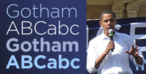 Sometimes, a movement can be defined by a typeface. But sometimes, good typography just allows the truth to speak in a clear, unflavored voice. I know the first time I saw a ‘Change we can believe in’ banner behind Barack Obama, I was pleased and inspired by his team’s smart choice of Gotham, a typeface I’ve been (over?)using a lot lately, and one that, for some reason, gives me a centered, unsubtle sense of well-being every time I gaze upon its sans-serifed geometries. Ahhh.
Even though, as the font’s designers explain here to ‘Helvetica’ filmmaker Gary Hustwit, the font’s origins (and those of its creators) are firmly of the windy streets of New York City, I think the face transcends the Grande Pomme and in fact speaks to me as confidently from snow-filled Iowa and sun-drenched California as it would from the deep shadows around the Port Authority Bus Terminal or the glassy trendiness of, well, what I imagine the headquarters of GQ magazine to be.
It’s just a darned pretty sans-serif. It stands up to abuse. It’s modern indeed. And thanks to the 2008 campaign, it’s everywhere you look.
Worst. Prop. Ever.
Wednesday, February 20th, 2008
So, we (and by we I mean Sammy) were punching around trying to find actual content on the television last night, after perhaps having had our fill of Anthony Bourdain and before Wolf Blitzer’s magic Wall of Counting Down (not to be confused with Keith Olbermann’s Countdown) was willing to call Wisconsin for Obama, and, okay, I’ll admit it, we watched thirty seconds of Hawaii Five-O on WSB’s second digital channel, a seemingly random collection of ancient reruns, from Perry Mason to Knight Rider apparently provided as a trickle of revenue stream to broadcast channels.
 At any rate…we saw Steve McGarrett questioning a Hawaiian security guard in the lobby: “Are you sure you saw him come in at 9:41?” The guard said: “Positive. All three of us saw him.” “Three of you?” “Yeah, me, my partner”—indicating another guy at the table—“and the computer.”
The role of the computer is being played by—I’m not kidding—a consumer-grade Akai reel-to-reel tape deck with a small silver box duct-taped to the side, from which he clumsily yanks a card that says in typography much more 1970s printing house than 1970s computer: “9:41 PM”. They didn’t bother to dub in bleeping or adding-machine sounds.
The IMDB entry on this episode says in the comments “The teleplay by Jerome Coopersmith is from Malle’s Ascenseur Pour L’Échafaud, a sort of translation by way of homage.” This site dismisses it as a collection of unlikely events that strain belief. Me, I just like that it was so cheap a show that when they asked the prop guy for a computer, that’s what they got. Apparently in a different episode, they shot a scene inside a US Post Office that was supposed to take place in a shop in Hong Kong …and then flipped the film so the “Use ZIP Codes” and “Buy Stamps” signs were..uh..more Chinese?
Point of interest.
Friday, February 15th, 2008
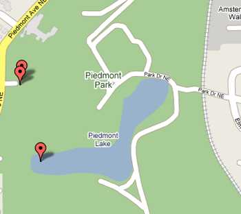
Piedmont Park, according to Tele-Atlas.
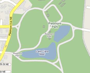
Piedmont Park, according to NAVTEQ.
Well, the more you depend on technology, the more you can be tripped up by the errors in data that technology can seamlessly present to you as “fact.”
You may not know that Google uses more than one set of map data for its various products…Google Earth, their online maps, and the iPhone Google maps application, just to name three.
In order to save money (or something involved in the byzantine licensing structures involved in using map data for purpose ‘A’ versus using it for purpose ‘B’), they provide you with seemingly ‘the same map’—but constructed from data from different providers…and sometimes they don’t agree. Take these two images. The one where the body of water is labeled ‘Lake Clara Meer’ came from NAVTEQ, and the one where it’s labeled ‘Piedmont Lake’ comes from Sanborn Tele-Atlas.
The naming disagreement aside, the images are interesting in how much else is subtly different…the outline of the lake isn’t quite the same…in fact, NAVTEQ depicts it as two separate lakes, and shows a road or pathways all around the lake. Tele-Atlas seems to think those paths stop part of the way around the lake. NAVTEQ thinks the cluster of buildings at the NW corner are not part of the park…Tele-Atlas disagrees. NAVTEQ includes several small buildings inside the park…Tele-Atlas leaves them out but shows you the shopping center (‘Amsterdam Walk’) on the eastern edge (I’ve largely cropped it out, though.) NAVTEQ has a second ‘Piedmont Park’ label on the small cluster of buildings in the center…go figure.
Fortunately for them, I am the ultimate arbiter of all things geographical in our neighborhood, and I have my verdict.
And (ripping envelope open), the winners are:
- The name of the lake is, of course, Lake Clara Meer. (Sammy and I walk around it all the time.)
- The lake is actually one body of water, with a pedestrian bridge across it where NAVTEQ shows a break.
- The buildings on the NW corner are those of the Piedmont Driving Club (a snooty private club), and are indeed outside the park.
- The pathways are much more as NAVTEQ depicts them but don’t try to drive on them.
(By the way, ditch the plain ol’ map completely and take a look at Google’s very high-res airphoto/satellite imagery they have of the park to see all of this in excruciating detail.)
The good news here is that you can at least do good for your fellow navigatees by reporting these errors. The trick, of course, is to get the correct info to the correct data provider. Just complaining to Google doesn’t, in general, help. If the data copyright (in tiny type at the bottom of your map) says “NAVTEQ”, then you can report the errors here. For Tele-Atlas (the copyright says these days ‘Sanborn Tele-Atlas’), use this website.
Semi-amusingly, both sites have verbiage that implies that their data sets started out absolutely perfect to begin with, and it’s just the sturm and drang of our changing world that necessitates having a place where corrections can be made (“In our changing physical world, where a significant percentage of roadways are altered every year, the Tele Atlas database must undergo continual enhancements to reflect factors ranging from navigational changes caused by construction projects to the creation of roads in new housing developments…”) Well, some stuff comes and goes, but Lake Clara Meer has been there for a century or so…and last I checked, it still is.
CoSA for celebration.
Friday, February 8th, 2008
Let us now take just a small moment and praise the product now known as Adobe After Effects, which started life as a rudimentary—yet breakthrough!—product at the Company of Science and Art. Three (or is it more?) guys named Dave created this program, which launched into the world in January of 1993…that’d be fifteen years ago.
What it does (for those of you who don’t do layered television graphics for a living) is make layers of Photoshop and Illustrator and type and Quicktime movies (and nowadays about three dozen other types of files) move, bend, arrive on screen, depart with elegance, pirouette, take bows, and do all of this without the need of a big television control room.
This was huge and profound for me back then, right after I had gratefully moved away from the world of $170,000 Quantel Paintboxes to Adobe Photoshop. I remember rendering out a short sequence of frames…they took forever…but when they were done they were (gasp!) fully realized, fully broadcast-quality. I could begin to move away from booking expensive control rooms at several hundred dollars an hour and do it all…at home. It was a big wow moment.
Nowadays so much of what you see before you in television and feature films has passed through After Effects…well, you’d be amazed. From subtle color correction to creations of hundreds of high-res layers smushed together, AE is a fundamental tool even at facilities that claim to only use gear that starts at six figures.
That’s why when some of the Adobe programmers dropped by years ago to treat me like a lab rat, I got them to..uh..sign the box, shown here (to the right…click on it for a larger version.) Hey, they’re celebrities in my world. And there, on the screen of my ancient Powerbook, is that first version of the software…running this very afternoon! CoSA lives, indeed. And Adobe deserves a considerable chunk of credit for encouraging this product’s development while somehow keeping it, at its core, what it is. Flexible, fast, fun to use.
Happy birthday DaveS, DaveH, DavidC, Dan, and all you Michaels and Jameses and Ericas and Steves and Saras and Wills and Vlads and Colemans and Guptas and all the other folks who have made it the fine product it has been all these years. Sincere thanks for making me a fine, fine tool to do what I do.
Emotional response.
Thursday, February 7th, 2008
 I’m starting to take it personally that local news and 24 hour cable news—which I certainly had a small part in and made a living from—adding moving colors, shapes, and typography over the years—is not only unwatchable, but is verging on the toxic.
A news consultant (who I went to school with, if memory serves), offers this tidbit to would-be reporters in this morning’s ShopTalk (read by lotsa TV folk):
Ask questions that elicit an emotional response
Facts are easily written into the script. What’s not easy to convey in a script is emotion. That’s what the soundbite is for. In doing an interview, reporters and photographers should ask a question that will elicit some emotion, and the response is what should be used in the story.
This explains a lot of what I’ve been seeing, and I wonder where the heck consultant-boy got that idea, because we sure didn’t learn in journalism school that our job was to elicit or extract emotion…to sidle up to interviewees and figure out how to leech every bit of emotion—true or otherwise—from their souls. There must have been some seminar—in the mid-80s?—that established new rules that I missed.
But it explains a lot.
I think somewhere along the line the idea that storytelling requires an emotional component got miswired into the DNA of a generation of broadcast journalists.
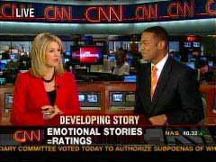
Sure stories can carry an inherent sense of tragedy (as Super Tuesday’s tornado deaths do), but to go on and revisit that tragedy again and again…to fly out the next day and go live, literally picking through the pieces of people’s lives for a moment or two of “good television,” well, my emotional response is that’s just sad..for us, for journalism. Yes, I’m looking at you, CNN Newsroom.
The consultant (a “morning news specialist”!) even offers examples of good soundbites and bad…the bad ones, in his book, are the ones where the interviewees just give you the facts of the story. The good ones, the ones you are supposed to wring out of exhausted fire chiefs, would be like this: “I had 6 of my guys on roof. I wasn’t about to let them get hurt, which is why I pulled them off right away. It scared the heck out of me when we heard that explosion! I sure was relieved when I saw all six standing safely on the ground!”
Where is my giant padded polo mallet of common sense when I need it?
What happens, of course, is that we have a media-savvy generation of people who have watched too much of this crap (and movies that have much the same) and they end up giving reporters precisely what they’re looking for—something that seems as if it conveys emotion, but is probably recycled dialogue from last night’s CSI. This cycle, of course, feeds on itself, and here we are.
So. Where do I sign up for a 24 hour news channel whose mantra is to offer Maximum information, Minimum emotion? BBC World News and the News Hour with Jim Lehrer only get you so far, but in the midst of our spreading TV substance drought, you take what cool water you can get.
Spindeterminante.
Wednesday, February 6th, 2008
I knew things were going to be interesting when I was picking up some Cold Dairy Product for our Super Tuesday night dessert at the grocery store we generally avoid. A thirtysomething African-American woman and a thirtysomething pasty white woman were chatting in the aisles. Said the former:
“I just don’t think he’s ready yet. It’s gonna happen. It can happen now. But he doesn’t have the experience, and she does.”
On the other hand, Fulton County went overwhelmingly for Obama (as did I, by the way, with a friendly goodbye wave in John Edwards’ direction)…so what does any of it prove?
The nice thing is that we have all kindsa great online tools to look at the returns. I’m annoyed as heck at CNN, who puts all these powerful visualization tools in the hands of John King and Wolf Blitzer (“Wolf! Step away from the multitouch display!”) and yet on their massively-promoted website, all we get are county-by-county results in tables…no map!
This just in. Maps are good! Visualization is good. These maps showing winners by counties can be illuminating, thanks very much New York Times.

Even more illuminating though is the breakdown of results by margins..that is, the colordot is small if the candidate won by a tiny amount, more huge if he or she took the region decisively:
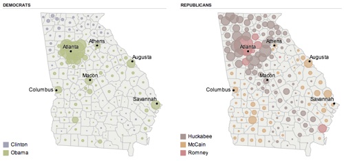
It’s pretty much that way from sea to shining sea…a lot of counties, on the democratic side, where the margins are razor-thin…this really is turning out to be a 51/49 kinda thing, Obama here, Clinton there. (On the Republican side, I’m unnerved as usual by the amount of fervent Christian politics that surrounds the Atlanta metro area. They like Huckabee, yeah, I can see that. So sure, go ahead, run him in November.
So what to do? Unleash the spinmeisters! (Just you wait.)

And while you’re at it, unleash the headline-writers. I’m entertained by this page of post-SuperTuesday front pages from across the country, which seem to empty the thesaurus in search of words that indicate a lack of decisive numbers…at least for the most part. Sprint marathon attack fight surge near-knockout epic battle…and then, in New Orleans, it’s simply carnival time.
I mentioned that I watched a fair chunk of the results come in using that increasingly antiquated device, the television. Let me just take a second to jot a few notes about what the traditional media outlets put before our eyes:
- Best visualization of exit polls: the virtual floating 3d chart thingy next to the quite caffeinated Ann Curry on NBC (and MSNBC). Clean, dimensional, and when the director let the camera man stop drifting back and forth to show us “hey, look, it’s 3d!”…quietly effective. And Curry, who I often find unwatchable, had her bullet points honed, focused, and clear every time I watched.
- NBC’s leaderboards, on the other hand, started with beautiful, clean, high-def columnar backgrounds marred by a repetitive twitchy spinning choreography of foreground elements that was beyond pointless. When Brian Williams had to plow through a set of a dozen projections, many for the same candidate, we got Hillary’s face spinning dizzily to reveal…Hillary’s face which then spun dizzily to reveal…well, you get the idea.
- NBC’s lower-third results: extremely clean, especially in HD.
- Worst verbal setup of exit polling information: Diane Sawyer on ABC. She seemed to be fumblingly reading every third bullet point from her misshuffled notecards, and the result was mass confusion. Was she saying that this number was “all evangelicals” or “all evangelical Republicans” or…well, even Charlie Gibson and George Too-long-a-last-name-for-me-to-type-here were looking baffled, gently correcting her, and in one case, disputing the numbers flatly.
- Most pointless, as usual: having a young woman (apparently only women are capable of this) read and summarize Facebook comments to us. Next, have an old geezer summarize the editorials in our nations’ newspapers! They’re both left to their own..uh..medium, thanks.
- NBC and CBS’s leaderboards had static images of the candidates faces…ABC had moving clips. Somehow the moving clips were much, much better. ABC’s graphics were quite clean in general, although in some cases way too sparse. Sammy kept imploring them to tell us “how many delegates? How many delegates!!?”
- CBS’s graphics get a big thumbs up for focusing on the delegate count again and again. They get a big thumbs-down for having some strange-ass scroll-like shapes and noodle-wobbly checkmarks and in general some graphics that looked like squared-up edges were anathema in CBS-land.
- And I just don’t get CNN’s approach of creating a principal election font that looks like it was pre-smudged while being drawn. That whole CNN=Politics look feels like “we spent all this money on high-resolution imagery so we could show you…behold!…smudgy stuff!” But man, they sure know how to count down to the next..uh..thing, whatever it is. CNN, your countdown clock channel! We know timers!
- At one point, WSB had squeezed back ABC’s coverage here to show, in an extremely unattractive way, results of how many people (13!) voted for…John Edwards in Arkansas!? In general, local graphics were lame…and WSB’s were the worst.
Exbucks.
Tuesday, February 5th, 2008
Well, yes of course I read all the stuff about Howard Schultz returning to take control of the wayward Starbucks and in a Jobsian way, bring them back to their roots…I just kinda figured that the one closest to our house was safe. Damn! This now means the closest ones are 0.9 miles (Little Five), 1.5 miles (Ansley), 1.5 miles (Emory) and 1.9 miles (Midtown) away. There was a point where our little stretch of Highland Avenue was choked with coffee places…we had a Caribou, a Starbucks, an Aurora, and a San Francisco all fighting it out within easy walking distance. That trendy moment in VaHi history has come and gone, I guess.
(Oh, and a footnote: replacing it is a Krispy Kreme. Yes, really!)
* * * * *
In other news, it’s Super Tuesday, and it actually gave me a moment’s pause, staring down at the evil Diebold voting machine as it displayed the Democratic candidates on the ballot…Gravel, Richardson, Edwards, Kucinich, Biden, Dodd…and the two actually still running.
* * * * *
And because it’s Fat Tuesday, I commend you to watch Nance buys Paczkis! In color! Hey pocky away, indeed.
Two pies.
Sunday, February 3rd, 2008
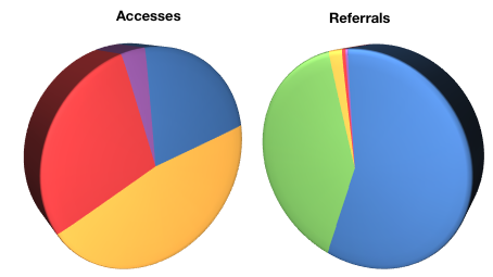
In the midst of the brouhahah online (relatively muted, actually) about Microsoft acquiring Yahoo, Sven S. Porst, a German blogger with an interest in Mac OS X and good design, took a quick look at his server logs.
It seems that the entities who suck down the most of his bandwidth spidering his site (all sites are regularly accessed and indexed by the search engines at Google, Yahoo, Microsoft, and others) do not correspond with the ones who return the most visitors to the site (“referrals.”)
Care to guess? Yahoo is yellow. Microsoft is red. Ask Jeeves is purple. Google is blue, and Google Images is green. So, there’s always the hope that if the most bandwidth-consuming competitors merge, they might not feel the need to hit his site quite so often for minuscule results.
